Alex Yang Logo Design

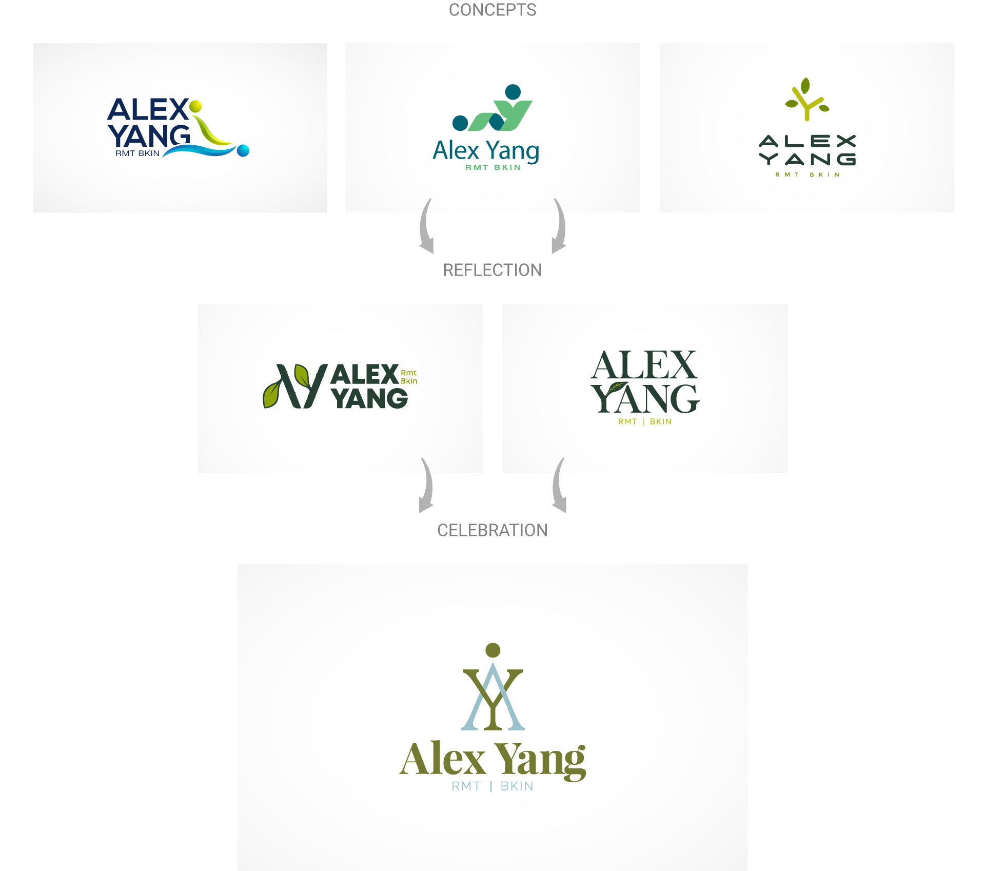
Peaceful, calm, and classy are words that describe our client's logo design vision for his massage therapy clinic. For his brand identity, our client opted for a color palette derived from nature elements such as earthy greens and blues due to their calming properties. Mapleweb logo design Vancouver team chose a simple font to create a feel of ease and a simple leaf design was incorporated into the logo to again relate to nature. An overall sense of relaxation is created through the logo.


