ONE OCEAN Logo Design
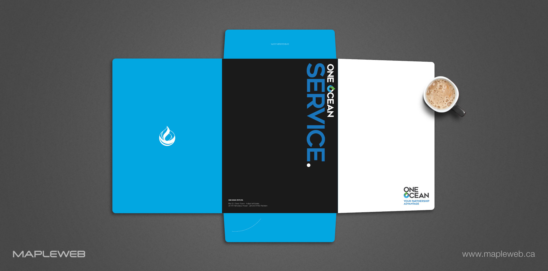
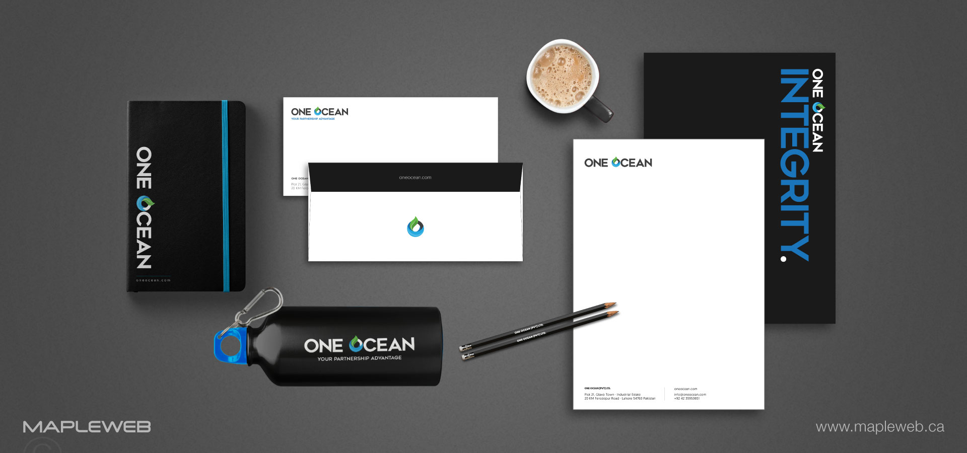
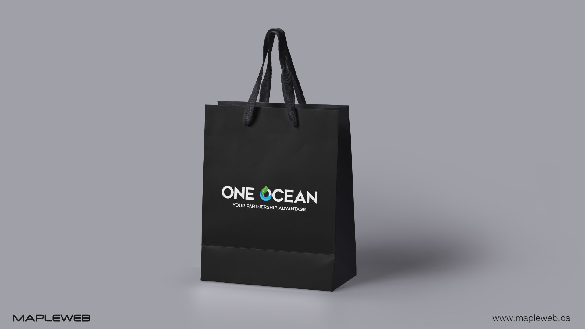
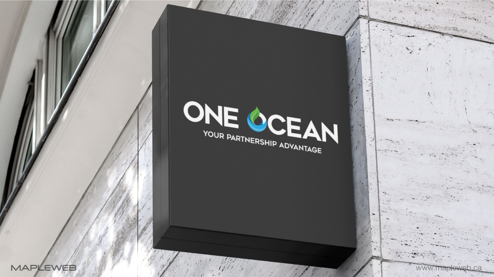
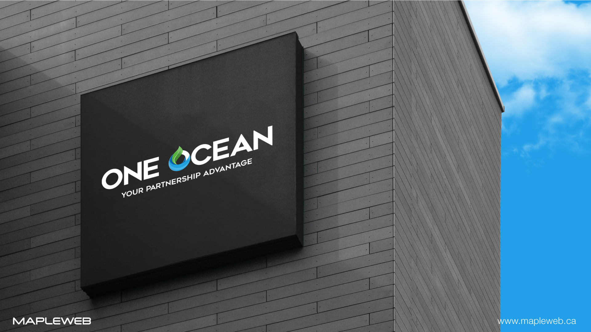
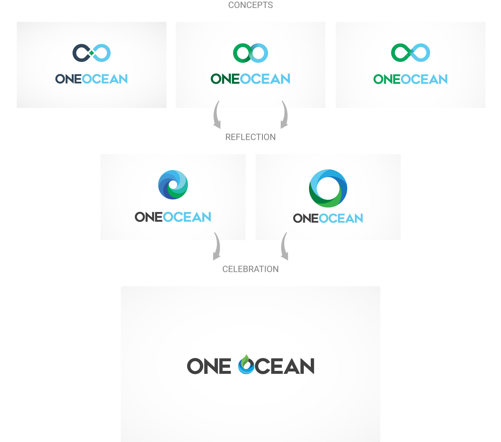
A harmonic design for a company that wished to expand its borders and business. One ocean symbolizes how intertwined and connected humans are. Simplicity was of high importance in this logo design. A classic clean and modern font was used to connect to their international clients. The color green was chosen to symbolize the sustainability by Mapleweb logo design Vancouver as they incorporate this feature into their work and the color blue to reflect the waters of the earth - doing business without borders.

Recent Blog Posts
10 Ways to Stay Up to Date with 2024’s Biggest SEO Trends
The world of search engine optimization (SEO) is always going through waves. It is crucial to keep a tab on the ongoing SEO trends as we approach 2024. To maintain your competitive edge and gain higher rankings in search engines. […]
Read more
Social Media Advertising: Optimizing Creative for Engagement on FB, IG & More
Social media advertising has become vital for businesses. It helps to reach out and connect with their intended audiences in the evolving digital marketing world. In addition to Facebook, there are newer options like TikTok available on these platforms. These […]
Read more
Best Tips to Increase eCommerce Conversion Rates
Business success in the fast-paced eCommerce landscape with high customer expectations and intense competition highly depends on increased conversion rates. Whether you’re a small, medium-sized enterprise or large corporation owner, optimizing your eCommerce web design and platform for enhanced sales […]
Read more
