Panda Power Logo Design

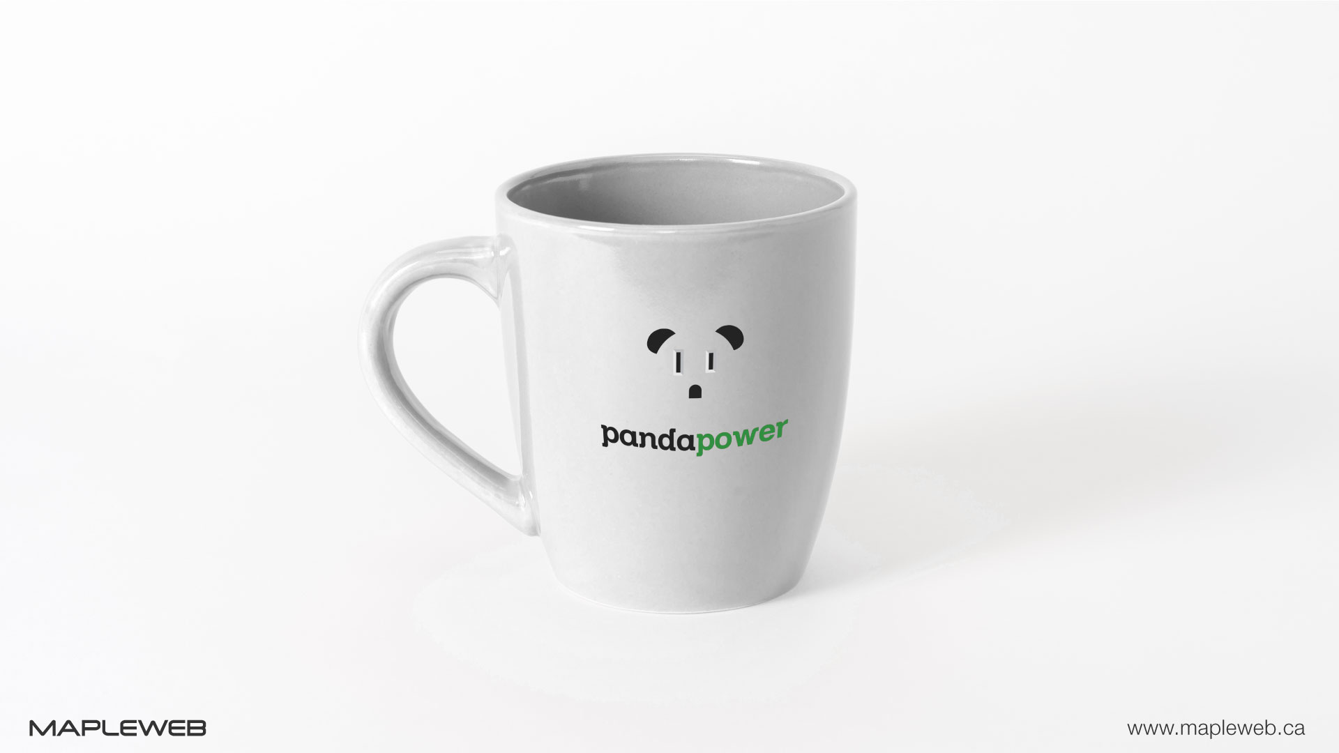
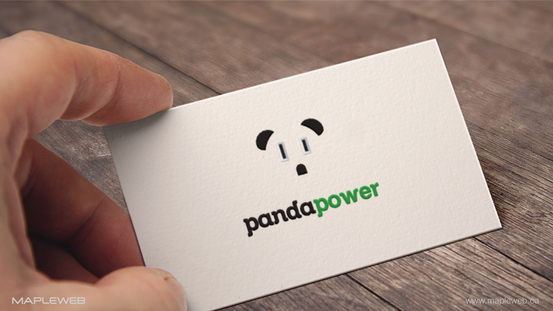
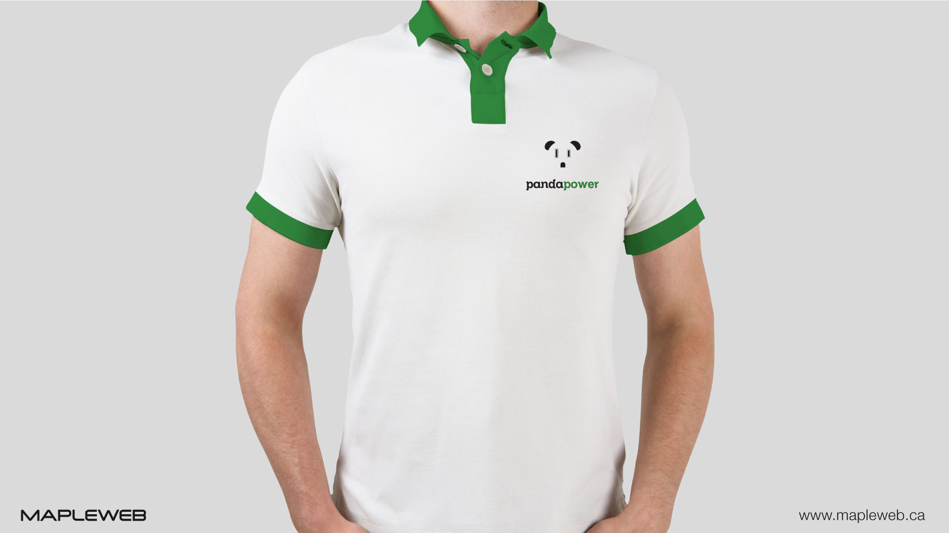
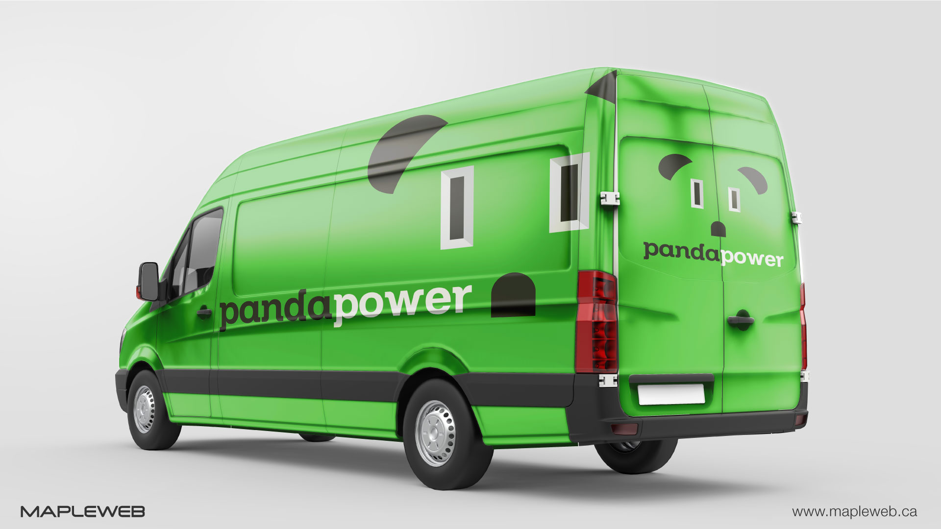
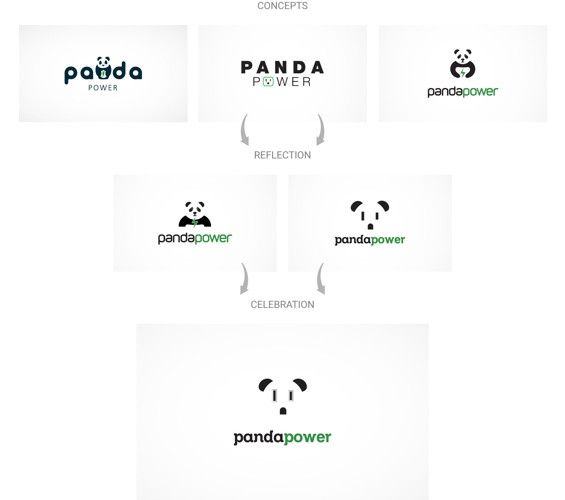
With such a fun name, creativity is essential to incorporate into their brand identity. Panda Power is an electrification company based in Vancouver with a flair. A fun play on the panda bear icon where the eyes as designed to resemble an electrical socket which makes for a memorable logo design. Choosing key color were of high importance by Mapleweb logo design Vancouver team. The panda bear itself remained true to its nature with a black and white palette with green highlights relating not only to sustainable energy but also to nature and the panda habitat.
Recent Blog Posts
10 Ways to Stay Up to Date with 2024’s Biggest SEO Trends
The world of search engine optimization (SEO) is always going through waves. It is crucial to keep a tab on the ongoing SEO trends as we approach 2024. To maintain your competitive edge and gain higher rankings in search engines. […]
Read more
Social Media Advertising: Optimizing Creative for Engagement on FB, IG & More
Social media advertising has become vital for businesses. It helps to reach out and connect with their intended audiences in the evolving digital marketing world. In addition to Facebook, there are newer options like TikTok available on these platforms. These […]
Read more
Best Tips to Increase eCommerce Conversion Rates
Business success in the fast-paced eCommerce landscape with high customer expectations and intense competition highly depends on increased conversion rates. Whether you’re a small, medium-sized enterprise or large corporation owner, optimizing your eCommerce web design and platform for enhanced sales […]
Read more
